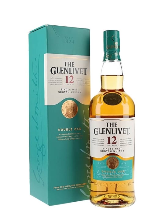
If you’ve ever tried to figure out the logo of The Glenlivet (bridge and river, on the cap as a faux woodcut, on the bottle in the form of a sticker), this page will help. But the chance to see this logo may be vanishing: there’s no logo on the newly redesigned bottle. I don’t know if the logo remains on the cap.
Those who read cereal boxes at the breakfast table grow up to read all forms of packaging.
Thanks, Elaine, for your decoding.
[The old bottle is much more attractive, says I.]
Tuesday, July 23, 2019
The Glenlivet logo
![]()
Subscribe to:
Post Comments (Atom)


The Last Wave is one of my favorite movies. "Are you a bird? Are you a fish?" I have more mixed feelings about Don't Look Now; parts of it are brilliant (and the ending is a real kicker) but the Sutherland-Christie relationship seems overwrought (and she's not my favorite actress). But The Last Wave is a movie I can sit back and savor anytime.
ReplyDeleteWe watched The Train with Burt Lancaster and Paul Scofield again this week. That's a brilliantly done movie, and one that asks uncomfortable questions about resistance movements, even when the resistance is completely justified. And we were rolling on the floor at A Summer Place, especially when Sandra Dee asks her boyfriend if he's been "bad with girls."
The Lost Moment sounds likes it's up our alley.
We laughed our way through the “sex scene” in Don ’t Look Now, though I know it was not intended as comic relief.
ReplyDeleteI’ve never seen The Train, though I still remember the stenciled announcements on the sidewalk outside the theater on New Utrecht Avenue, Brooklyn. The El ran overheard. I should see that movie. Thanks for the recommendation.
I loved the old thistle, but I understand the makers wanting something that stands alone for their scotch, that won't be co-opted and downgraded. I especially enjoyed seeing the process the designer went through, using a stylized 'G' and the river flowing under the bridge, among other things. Did you notice the river's reflected waves on the underside of the bridge?
ReplyDeleteSmooth-flowing, it is!
I think I need to revise that post to make my things clearer: the bridge is the current logo. It’s now been replaced, at least on the bottle, by a big 1842. I’ll have to look again for the reflections.
ReplyDeleteAnd Martha, I have to thank you, again, for pointing me to single malt Scotch. It’s been a really pleasant addition to everyday life (just two ounces, max).