Saturday, August 25, 2007

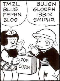
Proust: "collective, universal smiles"

Mme Verdurin is displeased:

[T]here was applied to her lips a smile that did not belong to her personally, a smile I had already seen on certain people when they said to Bergotte, with a knowing air, "I've bought your book, it's tremendous," one of those collective, universal smiles that, when they have need of them — just as we make use of the railway and of moving vans — individuals borrow, except for a few ultra-refined ones, such as Swann or M. de Charlus, on whose lips I have never seen that particular smile settle.

Marcel Proust, Sodom and Gomorrah, translated by John Sturrock (New York: Penguin, 2002), 391

All Proust posts (via Pinboard)

Friday, August 24, 2007

Remembrance of orthodontics past

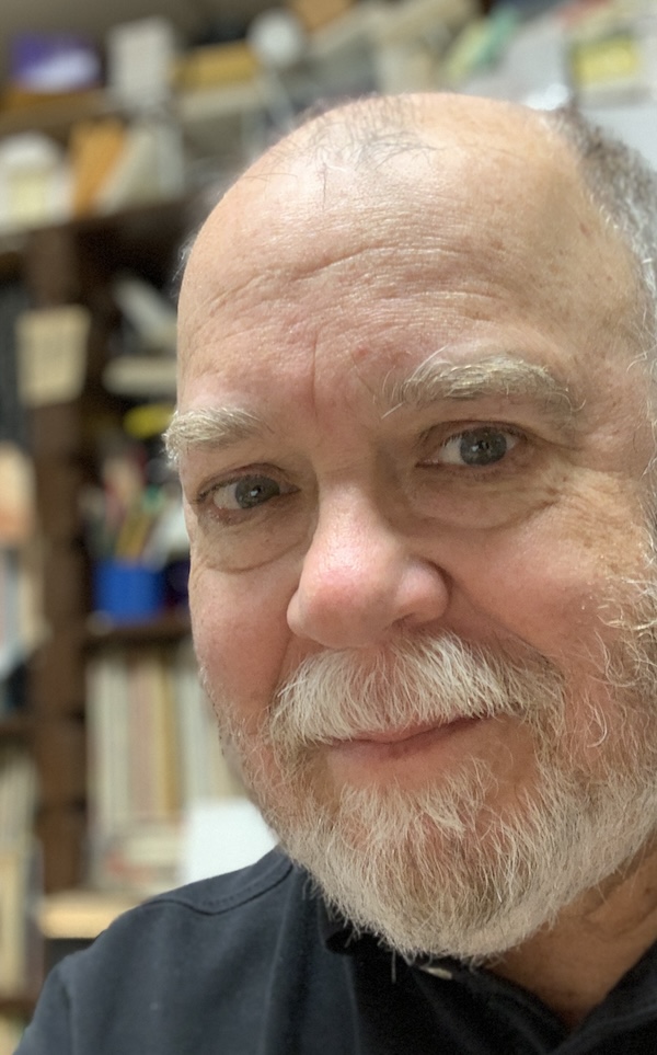
I've been told many times that I have a nice smile, and I have to believe that the tellers are telling the truth as they see it. But I don't have nice teeth. Two upper teeth tilt backwards, badly maloccluded, barely visible, giving my open-mouthed smile a gappy (albeit symmetrically gappy) look. So when a shutter snaps, I tend to zip my lips. I sometimes think about getting these teeth capped, but they've been with me so long that I find it difficult to imagine alterations. Besides, I am told that I have a nice smile.

Hearing the word braces the other day reminded me that I had them as a kid, along with "headgear" and elastics and a retainer, though none of it did much good. (I still remember, sitting in the chair during my final visit, wondering about the return on the investment.) I got curious enough to Google my orthodontist and was surprised to see that as recently as 2003, he was still at it, as the New York State Board of Regents documents. And still, after all those years, working with the same integrity and skill:


These are the only references to Sheldon Estrin that I can find online, aside from a current listing in what appears to be a clearinghouse for cut-rate dental plans. I wish Dr. Estrin's current patients better luck than I had.

[January 2008: I had the two teeth capped, and now I'm smiling. Thanks, Dr. Blagg!]

Related post
Crooked teeth?

Thursday, August 23, 2007

Dowdy farms

Spotted on a bag of Vidalia onions:

Dowdy farms: red-checkered tablecloths, pies cooling for "supper," fedora-wearing men on tractors —

Yes, my dowdy farms are straight outta Calverton, as Elaine immediately recognized. Well, I write about what I know, or what I don't.
All "dowdy world" posts (via Pinboard)

Wednesday, August 22, 2007

Pocket notebook sightings in Rififi


What can I say? I like these cameo appearances.

Rififi (1955) is an extraordinary movie by then-blacklisted Jules Dassin, director of The Naked City (1948) and Night and the City (1950). I'd liken Rififi to John Huston's The Asphalt Jungle (1950), another story of a perfect crime gone awry. The break-in and get-away sequences in Rififi offer 31 minutes without dialogue or music, only the sounds of a criminal masterpiece in progress.

Robbers and cops alike use pocket notebooks in Rififi. Robbers plan their heist ("Florist delivery 5:50"). Cops check for voitures volées (stolen cars). (Could traction be short for traction avant, front-wheel drive? A grey car with front-wheel drive?)

Rififi is available in a beautiful digital transfer from the Criterion Collection:

Rififi (The Criterion Collection)

Related posts
The dowdy world on film
Moleskine sighting
Pocket notebook sighting

Reading in the news

One in four U.S. adults say they read no books at all in the past year, according to an Associated Press-Ipsos poll released Tuesday. . . .

The survey reveals a nation whose book readers, on the whole, can hardly be called ravenous. The typical person claimed to have read four books in the last year — half read more and half read fewer. Excluding those who had not read any, the usual number read was seven.

"I just get sleepy when I read," said Richard Bustos, a habit with which millions of Americans can doubtless identify. Bustos, a 34-year-old project manager for a telecommunications company, said he had not read any books in the last year and would rather spend time in his backyard pool.
Read the rest:
Poll: 1 in 4 U.S. adults read no books last year (International Herald Tribune)

Related post
American reading habits

Tuesday, August 21, 2007

A pencil parade


Charless in Tallahassee left a link to this photograph in a comment on a pencil-related post.

The BBC explains: "Sue Grant snaps participants entering this year's pencil parade at Moniaive Gala in Dumfriesshire." Wikipedia tells us something about Moniaive, a village in Scotland:

Every year a number of festivals are held within the parish: Moniaive Horse Show, Gala Day, Arts Association exhibition, Beer and Food festival, Comedy nights, Moniaive Folk Festival, Horticultural show, to name but a few. In 2004 The Times described the village as one of the "coolest" in Britain.
I'm unable to find any suggestion of Moniaive's connection to pencils. But when has one needed a special reason to dress up as a pencil?
Your Pictures: 27 July–3 August (BBC News)
Moniaive (Wikipedia)
Moniaive (Village website, now empty)
(Thanks, Charless!)

Slow down and read

When it comes to reading, lifehacking tends to focus on speed — more words, fewer minutes. That might be fine if reading is understood as a matter of moving information with maximum efficiency from the page to the brain. The faster the connection, so to speak, the better.

But there are other kinds of reading. No one can race through a poem by Emily Dickinson or a short story by James Joyce and take away very much from the experience. Therein lies a problem for students reading literary works. On the one hand, there's the impulse to get through an assignment, to knock off a poem or story and move on to another task. On the other hand, there's the poem or story, the kind of text that invites and rewards patient attention.

My advice: slow down. Here's what the poet Ezra Pound says about reading literature: "no reader ever read anything the first time he saw it." Or consider this exchange between Oprah Winfrey and the novelist Toni Morrison: "Do people tell you they have to keep going over the words sometimes?" "That, my dear, is called reading." Or as the poet William Carlos Williams says in the poem "January Morning,"

I wanted to write a poem
that you would understand.
For what good is it to me
if you can't understand it?
                       But you got to try hard —
And here's the novelist Zadie Smith, in an interview, likening the reader of literature to a musician learning a piece of music,
an amateur musician who sits at the piano, has a piece of music, which is the work, made by somebody they don't know, who they probably couldn't comprehend entirely, and they have to use their skills to play this piece of music. The greater the skill, the greater the gift that you give the artist and that the artist gives you. That's the incredibly unfashionable idea of reading. And yet when you practice reading, and you work at a text, it can only give you what you put into it. It's an old moral, but it's completely true.
Taking the time to slow down — marking a passage, pondering a detail, looking up a word, writing down a question, changing your mind, looking at the page in a way that allows you to begin to notice what's there — might change, for keeps, your idea of what it means to read literature. Slowing down will also help you begin to understand how it is that some people seem to see so much in what they're reading. They know that reading well sometimes means taking your time.

Monday, August 20, 2007

Rorty on Proust

The late Richard Rorty had some wonderful things to say about Proust. My hunch is that Rorty too would be skeptical about the promises of a Proust tour. The novel's the thing, not the Guermantes way, not Combray, not Balbec:

Proust succeeded because he had no public ambitions — no reason to believe that the sound of the name "Guermantes" would mean anything to anybody but his narrator. If that same name does in fact have resonance for lots of people nowadays, that is just because reading Proust's novel happens to have become, for those people, the same sort of thing which the walk à côté de Guermantes happened to become for Marcel — an experience which they need to redescribe, and thus to mesh with other experiences, if they are to succeed in their projects of self-creation.

From Contingency, Irony, and Solidarity (Cambridge: Cambridge University Press, 1989), 118

A related post
Richard Rorty on the value of literature

All Proust posts (via Pinboard)

Sunday, August 19, 2007

Pages (iWork '08): How to make a drop capital

When I switched from Windows XP to Mac OS X, I decided not to install Microsoft Office on my new computer. I chose instead to go with Apple's sleek and beautiful iWork. iWork is not an Office-clone or Office-killer; it's a set of three elegantly-designed programs: Pages, for word-processing and document design; Keynote, for presentations; and Numbers, for spreadsheets. I spend most of my time in Pages and plan to keep my gradebook in Numbers. I am happy.

One disappointment though: Pages has no option for creating an initial, aka a drop capital or "drop cap." That omission seems surprising in a program that offers so many tools for page layout. It's relatively easy though to make drop caps in Pages '08 (or '06). Once you have some text to work with, here's what to do:

1. From the Pages toolbar or from Insert, choose Text Box.

2. Replace the words "Type to enter text" with the capital letter of your choice.

3. Highlight the letter that you've added and choose an appropriate font and size. Doing so will probably involve some trial and error.

4. Left-click outside and then inside the text box to show its borders.

5. Resize the text box. Here too, expect some trial and error.

6. With the borders of the text box still showing, open the Inspector (from the Pages toolbar or from View > Inspector) and choose Wrap Inspector, the third icon from the left.

7. For Object Placement, select "Inline (moves with text)."

8. Check "Object causes wrap" and select the icon on the far left.

9. For Text Fit, select the icon on the left. Change the Extra Space setting to 0. (You might experiment later.)

10. Now position the text box in your document. Depending upon the letter (or numeral) you're dropping in, you might need to tinker by changing Object Placement to Floating and moving your text box (then switching back to Inline). Or you might need to change the Extra Space setting. Getting things right here may prove tedious. But I think that the drop-cap effect is worth the effort.

Drop numerals look great too. I like to use them in materials for my students. Here's an example:


[Line spacing: 1.1. Text: 9 pt Lucida Sans. Drop-cap numeral: 36 pt Lucida Sans. Text box: .29 x .51. Extra space: 8 pt.]

Saturday, August 18, 2007

On the radio: Memory and Forgetting

A one-hour broadcast, from the series Radio Lab. Includes a segment with Jonah Lehrer, author of the forthcoming Proust Was a Neuroscientist.

Listen online:

Memory and Forgetting (Radio Lab, WNYC Radio)