[“Men and women looking up books through the card catalogue at the Congressional Library.” Photograph by Bernard Hoffman. Washington, D.C., 1941. From the Life Photo Archive.]
Sara, have you been time-traveling again?
A related post
Library of Congress (1946) (A short film)
Monday, March 31, 2014
At the Library of Congress
Sunday, March 30, 2014
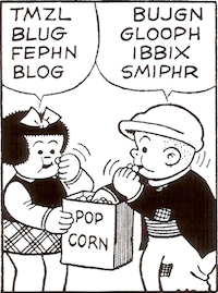
Oxford Vampire comma revisited
Ezra Koenig of Vampire Weekend, talking to the Columbia University student publication Bwog:
“I’d seen there was this Facebook group at Columbia called Students for the Preservation of the Oxford Comma, and that was the first time I’d heard of an Oxford comma. And that appealed to me in a lot of ways, because it has Oxford in it, and I like anything Oxford: Oxford button-downs, Oxford University, all that stuff. But then the fact that it’s a comma, the combination of something like really regal and at the same time, absurd. I remember sitting at my parents’ piano, and that was the first thing that came to my mind: ‘Who gives a fuck about an Oxford comma?’”The article’s writer lumps the Oxford or serial comma with “useless punctuation marks.” But as Bryan Garner’s Garner’s Modern American Usage points out, “virtually all writing authorities” outside of journalism recommend using the Oxford comma. Take that, journalism.
Here is Vampire Weekend’s “Oxford Comma.” And here is a discussion of punctuation with VW and Stephen Colbert. The comma talk kicks in at 2:42.
Related posts
How to punctuate a sentence (Includes the Oxford comma)
How to punctuate more sentences
Saturday, March 29, 2014
Baseball and handwriting
The New York Times reports on baseball players’ illegible autographs. With a beautiful account of Harmon Killebrew explaining the importance of good penmanship to Torii Hunter:
“Think about this: 150 years from now, you’re dead and gone, and kids are playing in a field,” Hunter recalled Killebrew saying. “A kid hits a home run, hits the ball in the weeds — far. They’re looking for the ball, they find it, and it says, ‘T, line, dot dot, H.’ They don’t know who it is. They’re like, ‘Oh, we found another ball to play with,’ because they can’t read it.Related reading
“But just rewind that. A kid hits a ball, hits it in the weeds, they’re looking for it, they pick it up and they can read it. It says, ‘T-o-r-i-i H-u-n-t-e-r.’ And they’re like, ‘Wow.’ So they go and look it up and they see this guy was a pretty good player, and they put it on the mantel and cherish it.”
Killebrew said, “You didn’t play this long for somebody to destroy your name,” Hunter recalled.
Celebrity-handwriting crisis
All OCA handwriting posts (Pinboard)
[Harmon Killibrew: I remember him from baseball cards.]
Fonts and ink and $
The buzz over a fourteen-year-old’s discovery that Garamond uses less ink than Times New Roman doesn’t surprise me. It’s a good story. But Suvir Mirchandani is hardly breaking new ground. In March 2009, designers Matt Robinson and Tom Wrigglesworth found Garamond to be an ink-thrifty font, thrifter than Courier, Brush Script, Times New Roman, Helvetica, Comic Sans, Cooper Black, and Impact. Also from 2009: Ecofont, which comes in a free version. There is nothing new under the sun, at least not in the recognition that some fonts use less ink than others.
[Granted, Robinson and Wrigglesworth’s novel methodology couldn’t produce numbers.]
*
7:38 p.m.: Daughter Number Three pointed me to Thomas Phinney’s analysis, which casts doubt on Mirchandani’s method and conclusions:
Garamond lowercase is about 14% smaller than Times lowercase (while its caps are only about 4% smaller). So it is no surprise that it uses less ink at the same point size. . . .Phinney (unlike CNN) includes a highly visible link to Mirchandani’s work. And, yes, the samples of Times New Roman and Garamond in the study are markedly different in size.
This is why most scientific studies comparing typefaces first compensate by resizing the fonts to eliminate differences in the lowercase height (called x-height by us font geeks). This study failed to do that. . . .
It should be obvious by now: you could just as easily save ink by setting the same font at a smaller point size.
In photographs of Robinson and Wrigglesworth’s experiment, the Garamond and Times New Roman samples appear (to my untrained eye) to be the same or nearly the same in size. So perhaps Garamond does save ink?
Even if Suvir Mirchandani’s work is flawed, I salute its spirit of inquiry. Why should the world run on Times New Roman anyway?
Thanks, DN3.
Proust et Zippy

[“Long Island Longing,” Zippy, May 4, 2013.]
Today’s strip is not the first Proustian Zippy. The Zippy archive has six more Proustian strips: “Proust Reduced,” “Forgetfulness of Things Past,” “Taste Is Everything,” “Proust Schmoust,” “Within a Budding Groove,” and “Dead White Cornflakes.”
Related reading, via Pinboard
All OCA Proust posts
All OCA Zippy posts
[For the reader who needs a frame of reference for today’s strip: Levittown, on New York’s Long Island, was the archetypal American suburb.]
Friday, March 28, 2014
NPR speaking
“Here’s some really cool music from Chile that I can’t stop listening to at the crib”: that’s NPR speaking, a few minutes ago. Maybe ironically, not that ironically would be helpful.
This kind of talk reminds me of a wonderful line from Ghost World (dir. Terry Zwigoff, 2001): “You guys up for some reggae tonight?”
Another cranky NPR post
A yucky Wednesday on NPR
Work from a “paper class”
The scandal at the University of North Carolina at Chapel Hill has been in the news for a while. But this ESPN report has a sample of work submitted for a so-called “paper class”: a paragraph-long Final Paper (at 3:06). Read it, and weep.
Word of the day: illeism
Found while browsing Bryan Garner’s Garner’s Modern American Usage (2009):
illeism /il-ee-iz-em/. Reference to oneself in the third person, either by the third-person pronoun (he, she) or by name or label. Two examples. In Shakespeare’s Julius Caesar (1598), the eponymous character consistently uses illeism, saying at one point: “Caesar should be a beast without a heart / If he should stay at home today for fear” (2.2.42-43). In the 1996 presidential election, the Republican candidate, Bob Dole, was widely lampooned for his illeism (“Let me tell you what Bob Dole thinks.”).I just met up again with the fictional illeist Uncle Doc Hines, a misogynist racist religious fanatic in William Faulkner’s Light in August (1932):
“It was the Lord. He was there. Old Doc Hines give God His chance too. The Lord told Uncle Doc what to do and Old Doc Hines done it.”And so on.
Related reading
All OCA Garner-related posts (Pinboard)
[Orange Crate Art is a Garner-friendly site.]
Thursday, March 27, 2014
Domestic comedy
“You’re not bringing mad money?”
“I have my phone.”
Related reading
All OCA domestic comedy posts (Pinboard)
[Mad money: “Money carried by a girl or woman with which to pay her own way home if she leaves her escort, usu. because of his sexual advances.” Harold Wentworth and Stuart Berg Flexner, A Dictionary of American Slang, 1975.]
Subscribe to:
Posts (Atom)