[Welcome, Moleskinerie readers.]

I gather that the 2006 Moleskine datebooks are not that widely available yet. Here are my first (and happy) impressions.
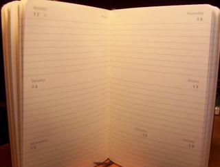
I bought the week-on-two-pages pocket datebook, which is a little thinner than the standard pocket notebooks. Like every Moleskine I've bought, it's beautifully made. The rounded corners and the slight bumps on the back cover from the glued-in ends of the elastic give the book a satisfying feel--more like, say, a leather briefcase than a memo pad.
Many pages precede the datebook pages themselves: an i.d. page ("In case of loss..."); a title page; a personal data page; calendars for 2006 and 2007 (one line per day); two pages for travel planning; a map of time zones; and pages listing international holidays, average temperatures, city-to-city distances, international calling codes, measures and conversions, and clothing sizes. Finally, there's a 5-inch/13-centimeter ruler printed along a page edge. At the back of the book, a detachable address book tucks into the familiar Moleskine pocket. There's also the folded page with the Moleskine story. No writing stickers though.
What makes this datebook useful to me is the switch Moleskine has made away from thin columns and back to lined pages. (The columns kept me from buying a Moleskine datebook for 2005.) Having nine lines to write on (eight for Wednesday and the weekend) allows for to-do lists and notes, not simply notations of events. I particularly appreciate the absence of printed hours, which always make me feel that I'm not using a datebook as I'm supposed to be using it.
I gave the other Moleskine datebooks a careful look--the pocket and large day-per-page books seem to have the same layout as for 2005, with hours running down the edge of the page (I didn't own one of those, so I'm going from glances here and there at the 2005 books--I may have missed some small changes). These books are simply too bulky for my taste, but anyone whose days are heavy with appointments should consider them.
I was surprised to see that the layout of the large week-on-two-pages datebook keeps to thin columns across the page, which I'm guessing might lead to some confusion and disappointment. It seems too easy for someone to assume that the large and pocket versions have the same format. So look carefully, and if you don't want to be fenced in, stay away from the large week-on-two-pages datebook.
Of all the datebooks I've owned, this Moleskine is the one that most delights me. Its many features appeal to my Swiss-Army-knife gene; its excellent paper takes fountain-pen ink well; and its small size makes it more useful to me than larger books (like Quo Vadis' Scholar). And unlike my Palm 515, it has no battery in need of endless recalibration.
Saturday, July 9, 2005
Moleskine 2006 datebook review
By
Michael Leddy
at
9:50 PM
![]()
Subscribe to:
Post Comments (Atom)


comments: 4
Thanks for putting the picture on your blog, Michael. Since the Moleskine datebooks come sealed it is great to have a look inside.
Elaine -
If you ever shop at Borders - just ask a bookseller if you can open one to take a look at the inside. We have a shrink wrap machine in back, and can always re-wrap it after you've finished, and we're always more than happy to open one so you can look at the inside... (just so you know!)
I'm really glad you confirmed the rumor that M would return to the previous weekly format. I hate hate hate the columns, and I was afraid they would go back on the change and just make the columns again for 2006.
Now I have another reason to look forward to the holidays;) Thanks!
I'm in the other camp - I loved the skinny columns - made it much easier to use as a planner or timecard log. The thin columns made it easy to track for recurring meetings, etc, and to see where time-wasters occurred, how they bumped the schedule.
My solution for lists and such was to take one of the pocket cahiers and tuck it under the elastic on the planner.
Post a Comment