
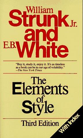
Poking around in a used-book store, I found a copy of Arthur Plotnik’s The Elements of Editing: A Modern Guide for Editors and Journalists (1982). The cover is worth a look, both for its once-modern, now-dated Helvetica and for the positioning of the book as a companion to The Elements of Style, also published by Macmillan. It’s not just the title or the Publishers Weekly blurb or the “From the publisher of.” The cover even looks like that of the then-current third edition of Strunk and White. (Plotnik went on to write Spunk & Bite: A Writer’s Guide to Bold, Contemporary Style.)
Much of the advice in The Elements of Editing applies beyond the world of publishing. Consider “Plotnik’s mantra of follow-up”: “NOTHING HAPPENS WHEN IT IS SUPPOSED TO HAPPEN WITHOUT WELL-TIMED REMINDERS.” Too true. Some explanation:
Trust and good faith. The words mean something different in communications than in the rest of life. Editors show trust and good faith by signing and renewing contracts, not by expecting people to have infallible memories and priorities identical to their own.The Elements of Editing is a dryly funny book. I can imagine Larry David and an adversary arguing about the firmness or timing of a nudge.
New editors who understand this principle will soon develop into functionally compulsive pests. They needn’t be insufferable. After all, “routine follow-up” is generally accepted as good business practice, and a reminder can always be tactful. Editors must also learn to distinguish between those who need frequent or infrequent nudging, firm or soft nudging. They must learn the best timing for a nudge.
[It’s called letter-spacing: see the comments for an explanation. Thanks, Daughter Number Three.]


comments: 4
Thanks for mentioning my old editors' guide, which still has some useful advice, as you point out. But I see the title became "The Art of Editing" as you wrote. So here's a timely follow-up:
I'm Art, but the title is "The Elements of Editing." The Book of the Month Club packaged it back then with Strunk & White's "The Elements of Style," boosting sales but creating an avalanche of copies to end up in used bookstores.
Best wishes, Art Plotnik
This type of tight letter-spacing was popular then. I remember when ordering typesetting, even into the mid-80s, the choices were tight, tight but not touching, and touching.
Although I would point out that the word "kerning" means the space between two particular letters, while the overall spacing as in this example is called letter-spacing (or in some unfortunate layout programs, tracking).
Is there still some egg on my face? I’m sorry for putting you to the trouble to point out my error — now corrected.
I’m really enjoying The Elements of Editing, despite what might seem evidence to the contrary (my carelessness).
Thanks DN3. I didn’t know that term but just looked it up:
“Letter-spacing refers to the overall spacing of a word or block of text affecting its overall density and texture. Kerning is a term applied specifically to the spacing adjustment of two particular characters to correct for visually uneven spacing.”
Post a Comment